Introduction to the Artist:

Seafret is a music duo from Bridlington consisting of Jack Sedman and Harry Draper. They first began their music career in 2015 when they signed to Columbia Records and continue to make music today. Their first album release was on 26th January 2016 titled ‘Tell Me It’s Real’ and peaked at number 56 on the UK Album Charts.
The Poster:
Typography:
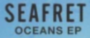
The typography for the ‘Oceans’ EP poster is bold and eye-catching. When creating the text for the band’s name the editor has made sure to use capital letters as this stands out compared to lowercase letters. The band’s name is also the largest piece of text on the poster which suggests that it is the most important. This may have been done so that audiences who see the poster will recognise who is releasing new music straight away. Additionally, the font consists of thick lettering which emphasises the boldness of the title. On the other hand, the name of the EP ‘Oceans’ is in a less prominent font. It is also a lot smaller than the band’s name. Making this information smaller implies that the title is important but the name of the band is more important for the audiences to know. When looking at the poster as a whole I noticed that these are the only two pieces of information displayed. Typically, most posters have a release date and sometimes a website meaning that this example is unconventional. To ensure that my own album poster is similar to the majority of real products I plan to include these two features on my own.
Images:
The images presented on this EP poster act as a background. Raindrops on a window are presented which connotes feelings of sadness. This may be an emotion displayed through the music thereby suggesting the style of songs the audience may hear. It is not uncommon for indie-acoustic/folk posters to feature nature on their advertisements as many of the songs from this genre present elements of naturalism. This can be found through instruments such as the acoustic guitar or through the very raw emotions presented in the lyrics. At either side of the poster are darker shapes which are blurred by the foggy window. Personally, I like this unfocused effect that the ran creates and may consider applying this to my own poster.

Colours:
The colour scheme used for this poster is made up of white, black and variations of blue. Throughout the background, different shades of blue can be found. This is as the sky transitions from blue to a light shade of blue. Additionally, the blurred shapes either side of the poster create a darker blue colour. Using different shades of the same colour will always work well as it makes a gradient effect.

The text on this poster is black. As the majority of the background is a light blue having a darker shade for the text will help there to be a contrast making it stand out more. This is important so that the audience can see the information clearly.

Positioning:
The positioning of the images and text on a poster is highly important to so that the audience sees the information clearly. In this example, the images have been placed either side of the poster to create an area of space/light in the centre. Here the text has been displayed due to the lighter background and to fill in the empty space. Looking at the poster overall I noticed that it is presented in a landscape format. Although the majority of posters are presented in a portrait fashion I am considering breaking this convention and having mine landscape.
References:
