Introduction to the Artist:

The Maccabees were a band formed in 2004. They consisted of Orlando Weeks, Hugo White, Felix White, Rupert Jarvis and Sam Doyle. In their early years, The Maccabees released their first album titled ‘Colour It In’ which reached number 24 in the UK Album Charts. From this, they were able to go on a tour of the UK and eventually sold out the majority of their shows. Later in 2012, the band announced on their website that they were to release a new album titled ‘Given To The Wild’. This album went on to gain the number one spot in the UK Album Charts, a nomination for the Mercury Prize and eventually was certified gold in the United Kingdom. In more recent years the band released various singles, however, in 2016 they announced their split on Twitter. Not leaving their fans disappointed they arranged a goodbye concert which ran throughout 2017.
The Maccabees album ‘Wall Of Arms’ features song such as:
- Love You Better
- Can You Give It
- Young Lions
- Dinosaurs
- Seventeen Hands
- Wall Of Arms
The Poster:
Typography:
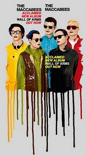
The typography for the ‘Wall Of Arms’ album poster is eye-catching. A very simplistic font has been used to ensure that the audience is able to clearly read what is written. This will allow for them to take in all the necessary information about the new album. Capital letters have been used throughout the band’s name and the album title creating a bold effect. Overall this adds to the text and emphasises it making it stand out. The band’s name has been printed twice on the poster. Printing this name twice perhaps makes up for the size of the text as in regard to the other information it is the same.

Underneath the band’s name is the text “Acclaimed new album Wall Of Arms out now”. This uses the same style of font as the band name which creates a sense of consistency in the poster making it look professional. However, this piece of text is also printed twice. Once under the band name where some of the writing is in red and on the right where it is in yellow. Having the same text in different colours adds a vibrant tone to the poster while getting the information across.


Images:
The image that is displayed on the poster is of the band. Here they appear to be illustrated in a cartoon format. Many album posters have pictures of the artist on the front so that the audience will know what they look like. In this case, this example conforms to that convention. However, some album posters also display naturalistic elements such as clouds or sun. In this example, there are no forms of nature illustrated which means in this aspect it subverts the convention. Underneath each of the members of the band is what looks like dripping paint. This is something that although isn’t common I like the look of. To me the way the image and the paint blend together makes the picture of the band look more interesting than a standard photo.
Colours:
Typically album posters will use a minimum of three colours. This is so that they avoid any colour clashes which may make the poster look unprofessional and unattractive. However, in this album poster by The Maccabees, the editor has used a wide variety of colours and breaks the typical convention. The colours yellow, red, green, blue, brown, black and white are used as well as a skin tone colour for the band’s faces. Although a wide variety of colours have been used in the poster the majority of them are found very close together on the colour wheel which means that they don’t clash. This is a technique I will consider using when it comes to making my own poster. In regards to the text, black has been used to present the title of the band. Using black will contrast with the white background and make the information stand out better. This has also been done with the text in red. As for the yellow text, this has been placed on a darker part of the poster as the colour yellow is light which may not show up against the white. Therefore having a darker background such as the brown and black will help create the contrast.


Positioning:
The image of the band has been placed in the centre of the poster as this is the spot where the audience eyes naturally fall first. At the top of the poster is the band’s name. This has been printed twice which will help the audience to understand what the name of the band is. Underneath this is some information about the album such as its name. Placing this underneath the band’s title will help the audience to automatically read the information helping them as it is near to what they were initially reading. At the bottom of the poster, the paint from the main image drips down. This helps the images to have a cool paint-like effect and fills in the blank white space at the bottom.
References:
